As founders of a tech startup we are passionate about being as productive as possible, constantly on the hunt to find the best software solutions to improve our workflow. For the past few years our team has predominantly been working remotely, so keeping productive has been of utmost importance to us. The following are our top recommendations and our daily drivers.

Communication – Discord
Tired of hearing “Slack, slack, slack”? Almost every startup team uses it, due to its simple to use interface and having almost every integration under the sun. Slack is turning ten years old this year, and it is beginning to show its age from a fast growing startup to a corporate providing monolith (not forgetting to mention their controversial rebrand). Its steep team-only pricing can be off putting for the new entrepreneur, and it relies heavily on a more closed community.
Enter Discord.
Originally aimed at gamers, Discord is a very light application i.e. it doesn’t slow down your computer as much as Skype/Slack. It’s crystal clear voice chat is seamlessly interwoven with text channels that make separating your conversations a breeze. We hold meetings every day over Discord - and its incredibly customisable user hierarchies allow us to interact with our team, customers and beta testers all on separate channels on the same ‘server’. The only drawback is that the integrations are not as expansive as Slack’s for now, but as Discord grows we are seeing more and more Startup teams making the switch.
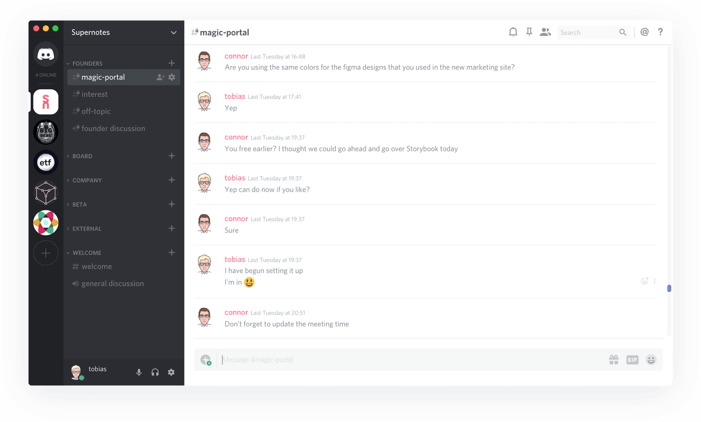
Our Supernotes Discord Server
The best thing about Discord is that all the core features are free (forever). And if you want to upgrade to their paid plan for $4.99 you get a boosted upload limit of 50mb and 1080p screen sharing - wave goodbye to Hangouts and Zoom. And for those bootstrappers out there, payments are done on an individual basis, so you aren’t forced into paying hefty plans for all your members.
- Price: Free
- Supersedes: Slack, Skype, Whatsapp, Zoom, Hangouts
- Killer Feature: The ability to drop in and out of conversations, with seamless text chat
- Drawback: Integrations aren’t as comprehensive as Slack
Find out more: discordapp.com
Project Management – Notion
Trello cracked the original formula for better digital Kanban boards, and in 2017 was acquired by Atlassian for $425 million. Since then not much has changed and some other startups have begun to adapt and improve the Kanban formula. One of these notable startups is Notion (mind the pun). Notion has completely overhauled our project management. Two years ago, we were using a combination of Trello for tasks, with our meeting minutes/docs recorded in Dropbox Paper. This disjointed workflow often saw us neglecting outstanding projects and our boards were filled to the brim with to-dos - making our workload seem an impossible task.
Notion changed things for us. Hugely. Imagine having your Trello board and in a single click you can switch all of your information into a list view, or if you have tasks ordered by date - a calendar view. This along with the ability to create infinitely nestable pages, allows you to form a comprehensive knowledge base. We have written the whole documentation for Supernotes on Notion, added all of our tasks to a pinboard, along with a separate table for all of our contacts, and more!
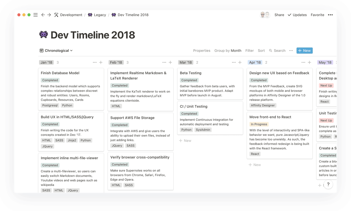
One of our old Notion dev kanbans
What’s great is that you can link variables from one table to another. For example, I can add a ‘contact’ to a ‘task’ in our pinboard. It makes our team’s lives so much simpler. However Notion is still limiting with the fact that you can only have one page in one place - so this is great for standalone tasks and projects, but not ideal for learning or brainstorming (more on that later!). And with frequent updates and great customer support, Notion is a brilliant project management tool.
- Price: From $4/month
- Supersedes: Trello, Google Docs, Dropbox Paper
- Killer Feature: The ability to switch from a kanban board, to a table, to a calendar all within the same database
- Drawback: Definitely not a mobile first application, designed for Desktop
Find out more: notion.so
Note-taking – Supernotes
We couldn’t write a blog about great tools and not mention Supernotes… Currently the problem with note-taking is that tools like Evernote, Onenote and even Notion are all based around a page/file structure - where you write 2-3 pages at a time. This long-form note-taking structure often locks important topics and themes - grouping them together into individual documents. So repeating themes from ‘summaries’ to meeting ‘action points’ are fixed in that file - there is no way to quickly see all of your ‘action points’ side by side, without opening a mess of new windows.
Supernotes was built from the ground up, combining our own observations on learning techniques with the latest academic research. By segmenting your thoughts into smaller bite-size (note)cards you can easily ‘tag’ them and sort them accordingly. For example, you can have a group of cards all from the same meeting but with different tags from ‘summary’ to ‘actions’ - and can quickly organise them by adding/removing tag filters. Sharing is seamlessly integrated with your personal notes, allowing you to share cards with anyone, with the recipient able to put that card wherever they like in their own hierarchy.
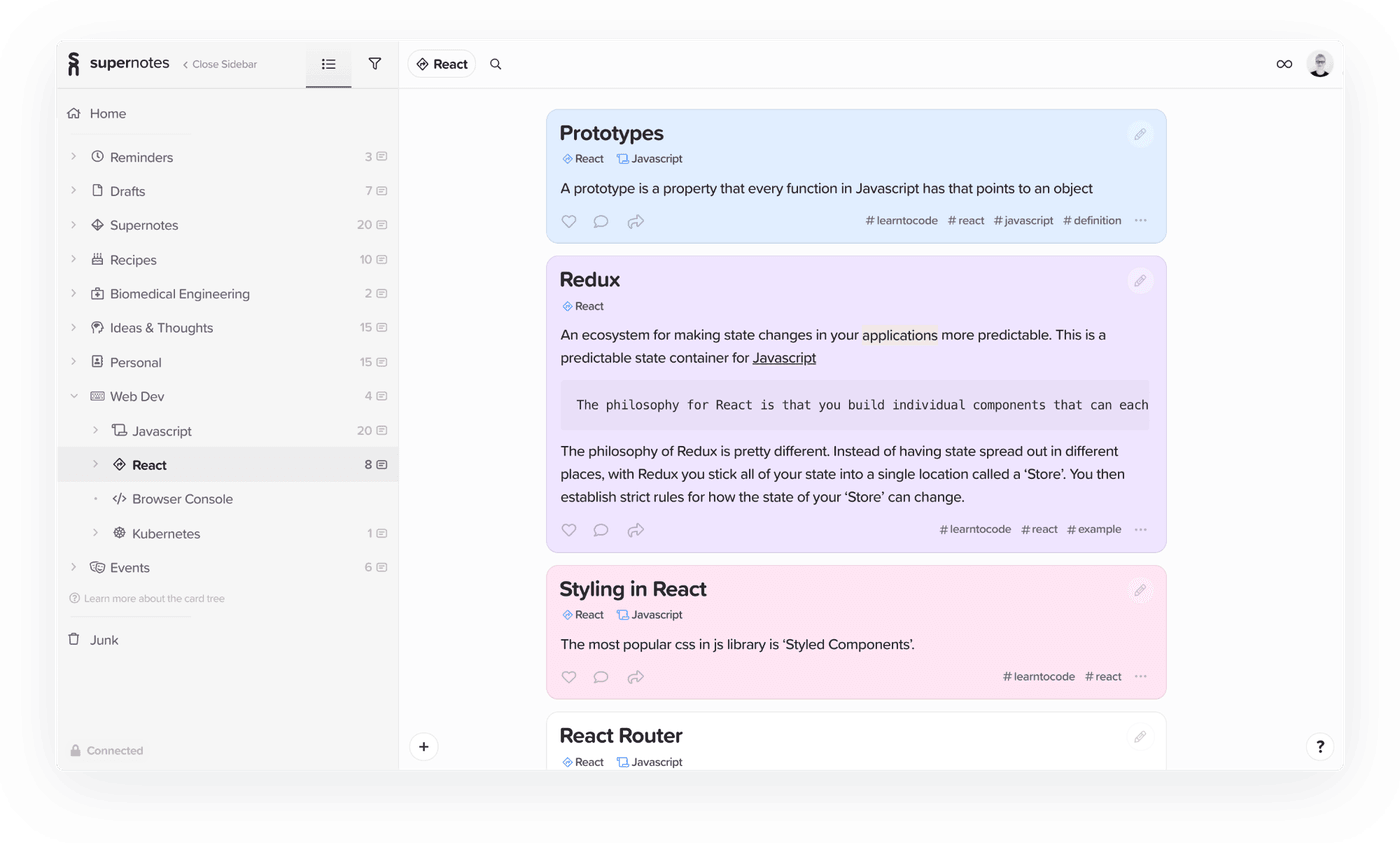
Some Supernotes on the fundamentals of the React language
We have been using Supernotes for when we attend workshops & seminars, and it is now our go-to reference for a wealth of information from marketing strategies to financial definitions. And best of all the more cards you write, the better it gets!
- Price: Free, $5 a month for Unlimited
- Supersedes: Apple Notes, Onenote, Evernote, Google Keep
- Killer Feature: The unique card format allows effortless organisation of your notes
- Drawback: No native apps (yet!)
Find out more: supernotes.app
Time Tracking – Timely
We tried a lot of time tracking tools and we could never settle on one that we liked. We have so much to fit into a day, that we often were too busy to think about manually tracking our time and setting it while carrying out our tasks. And with tasks often overlapping it became very difficult to remember what we did when. As we are based in the UK time tracking is incredibly important to us so we can claim R&D Tax relief. A few months ago we discovered Timely, which has one feature that puts it way above its competitors, Memory Tracker.
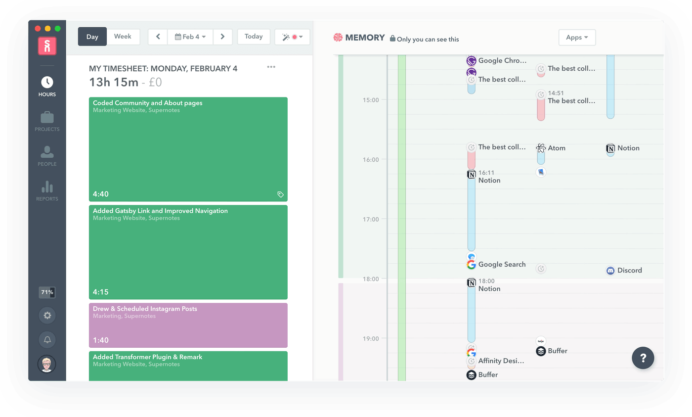
Filling a timely with my past activity as a reference
You install Memory Tracker on all your devices and in the background it monitors the applications you use, the phone calls you make, and the locations you are at. It might sound creepy, but this information is secure and only visible to you - never the rest of your team (its not like Apple, Google, and Facebook don’t collect this information anyways…). Then we are able to fill in our Timesheets with a few clicks at the end of every week, not having to worry about forgetting what we did when. We combine this with a reflection meeting every Sunday, to go over the week and share our progress. And the powerful data analysis and export features make it easy for us to identify where we are spending the most of our time, and how we can be more efficient in the future.
- Price: From $5 a month
- Supersedes: Spreadsheets, Everhour, Clockify
- Killer Feature: Awesome customer service
- Drawback: Can become quite expensive
Find out more: timelyapp.com

Mockup Design – Figma
We used to do all of our UX mockups on Affinity Designer, and it was great! If you haven’t heard of Affinity Designer it is an alternative to Adobe InDesign but with a flat one-off cost and no subscription. However, it quickly became limited when we started prototyping. We would be hosting our design files in the cloud, with only one of our team able to edit the files at a time and no easy way to edit and comment on the designs together. And if we tried it would often lead to the file corrupting 0_0.
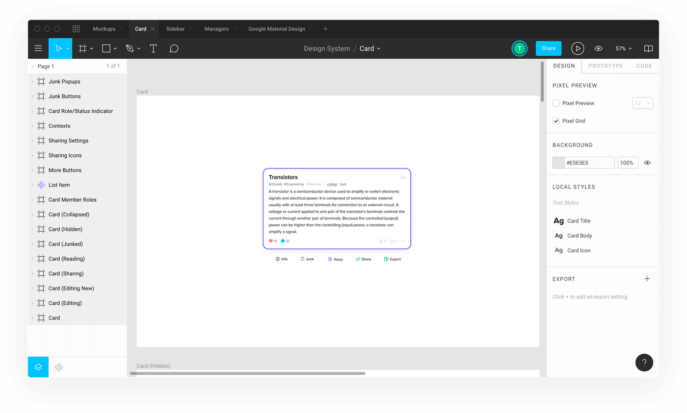
The new Supernotes card format mocked up in Figma
Last year we made the switch to Figma, and we have instantly been able to reap the benefits. Creating ‘components’ (design variables) allow for rapid prototyping, with changes reflected across all design files. And the pretty basic, but undeniably useful, Figma Mirror App for Mobile presents live previews of our Designs helping us immediately identify what needs to be improved. But the best feature of all is real-time collaboration allowing us for the first time to brainstorm new UX components over a call. Figma is a ‘web-app’, and can work from any modern desktop browser, which may seem great since you can access your design files everywhere. But this comes at the cost of performance and feature set. Figma is wildly inefficient, and you will see it eat up your CPU - and because of this it can’t do more complicated image processing that its native desktop predecessors could do. That said tho, for our use-case of UX design this is not an issue.
- Price: From $12 a month
- Supersedes: Affinity Designer, Adobe XD, Sketch
- Killer Feature: Real-time collaboration with design files
- Drawback: Feature set is narrow and not as diverse as standalone applications
Find out more: figma.com
File Sharing – G Suite
So the last application may be the most boring, but it is definitely the most useful. The Google application suite from Gmail to Google Drive, allow for effortless and secure file sharing (if you use them appropriately!). If you already have G Suite make sure you have downloaded ‘Google Drive File Stream’, which automatically syncs files between your teams devices - ensuring everyone is up to date and on the same page.
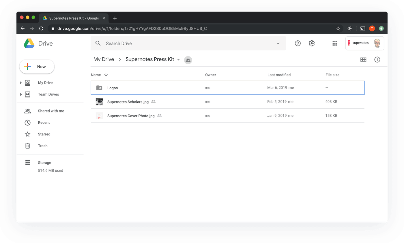
You can also host public items in your G Drive, such as our Press Kit
G Suite brings all of your services together, we regularly export our data onto Google Drive from Figma, Timely, Notion and even Supernotes so we have hard copies backed up. Since we are so dependent on our digital services, we need to ensure we can access them anywhere even from our phones, which Google Drive allows us to view these with ease.
- Price: From $6 a month
- Supersedes: Memory sticks
- Killer Feature: Real-time syncing in the background
- Drawback: Can kill your disk space if your team likes large files
Find out more: gsuite.com
We hope this was a helpful insight on some possible ways you could improve your digital workflow, be it solo or in a team. Use something different? We would love to hear your thoughts, let us know on twitter, @supernotesapp.

Take notes effortlessly
Join thousands of happy notetakers!