A friendly new typeface that's open source and free for both personal and commercial use. We've carefully re-designed each character, improving support for Markdown and ligatures. This font family is continually being updated and improved.
We really care about creating the best reading and writing experience. Our note-taking app, Supernotes, has always been about speed and simplicity – open the app and within seconds start jotting down your thoughts. There’s only one font available to help you keep focused and just take notes. We don’t want you to spend time debating between Arial and Times New Roman, but that means it’s important we get that one font right.
Over the last five years we’ve tried out a bunch of different typefaces for Supernotes. While some have looked fantastic, we’ve always run into the same developmental challenges. Sometimes we had to add hacky margins to certain characters so they’d display correctly and certain characters weren’t available at all. Our community also notices these small details, asking for more consistent weights, improved ligatures and better international language support. We’ve outgrown current font family offerings and needed something more fine-tuned.
Supernotes Co-founders, Tobias and Connor, designing and discussing SN Pro
We previously built a custom markdown text editor, based on an open source library we support, so why not do the same for a font family? With the recent launch of our mobile apps, we set out to do exactly that – design, build and test our brand new typeface, SN Pro. You’re actually reading SN Pro right now.
The Devil is in the Details
SN Pro is based on Nunito, a brilliant rounded font designed by Vernon Adams. While very fond of Nunito, there have always been things we wished we could adjust.
So we took it upon ourselves to carefully re-think each and every character – lowering cap heights, improving kerning (spacing between characters), and modifying any quirky characters that looked a bit out of place, such as the Q and t. Have a look for yourself:
We also gave SN Pro a little flair, such as a swish in the lowercase “e”. To finish off we also modified the font weight ratios, so that bold would be bolder and more distinct. This is all based on Community feedback. Here’s a little passage you can read to tell the difference.
With our community testing, SN Pro was consistently voted to be more clear and readable. Another modification was adjusting numerals to be proportional, again improving the kerning for different scenarios.
Comparison of Nunito and SN Pro Numerals
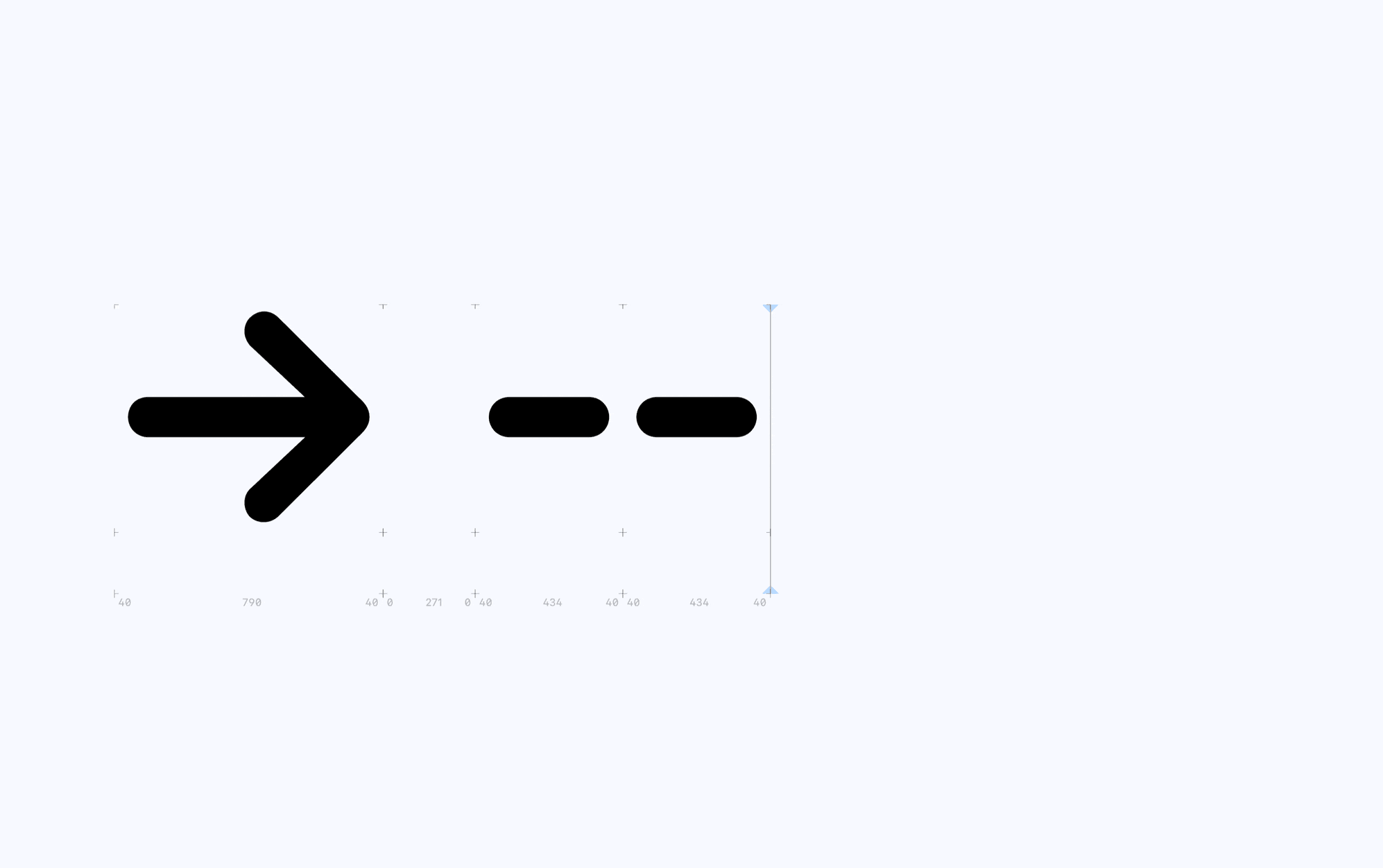
To wrap up, we included arrows, circular numbers, and improved symbols for use within Markdown – the commonly used text markup language that Supernotes is built around.
Our favorite feature with the new arrows is their full ligature support (another community feature request). Here’s a quick screen recording, showing them in action:
Why did we call it SN Pro?
SN stands for both Supernotes, the note-taking app this was designed for and “Super” Nunito, the open-source font we started with. We’re serious about note-taking, so we need a professional font to match, hence the addition of ‘Pro’.
SN Pro is available in eight different weights ranging from Thin to Black. Currently only Latin and Cyrillic are supported but we will be increasing support for other languages in the future.
Eight different weights to choose from
Open Source. Free for you. Always.
At Supernotes, we put a big emphasis on data ownership – everything is private, secure and yours. While our app isn’t open-source, all your notes are written in a portable markdown format, so you can export them whenever you like.
We continued this ethos with SN Pro. It’s free and open source, so you can safely use anything made with Supernotes for any personal and commercial projects. You can even add SN Pro as a font to your favorite third-party applications to create a more familiar ‘transitional environment’. For example, expanding your ideas in Microsoft Word for that university essay or displaying a presentation with iA Presenter.
Here’s how how SN Pro looks in the wild with a few different font pairings:
This typeface is brand-new, so there may be a few edge cases we’ve not encountered before. If you notice anything that looks odd or can be improved, please let us know on our Community Forum or send us an email at [email protected]. And if you are really into type, feel free to check out the source files on Github.
Support Us
The SN Pro font family, Supernotes applications, and everything you see right now has been built by a diligent team of two. We are a small business that’s sustainable and not dependent on venture capital. If you’re an individual who’s a fan of our work you can support us by upgrading to our Unlimited plans.
Or if you’re using SN Pro in your own commercial applications please consider sponsoring SN Pro below. Even though the typeface has an Open Font License, we encourage you to contribute so we can dedicate more time to the project. We will also prioritize your requests as a sponsor, provided they align with the vision for SN Pro.
Closed source fonts are expensive, help us make sustainable open-source fonts a better alternative. With your support we will add more ligatures, languages and symbols. And follow us @supernotesapp on X for more typeface and productivity content. Thank you for your support, it means a lot to us.